Community Connection Reimagined
The Challenge
Gnowangerup Family Support Association Inc. wanted a rebrand that reflected its heart as a community hub. The existing identity no longer communicated the inclusivity, warmth, and diversity of the services it provides to families. They needed a brand that would feel approachable, modern, and deeply connected to their role as a place of gathering, support, and growth.
The Idea
To design a brand identity that embodies connection, unity, and diversity. Inspired by the concept of meeting places, individuals, and groups coming together, the visual direction needed to resonate with both the local community and stakeholders, while also being adaptable across digital and print media. A warm, earthy palette with touches of softness was chosen to reflect inclusivity, trust, and care.
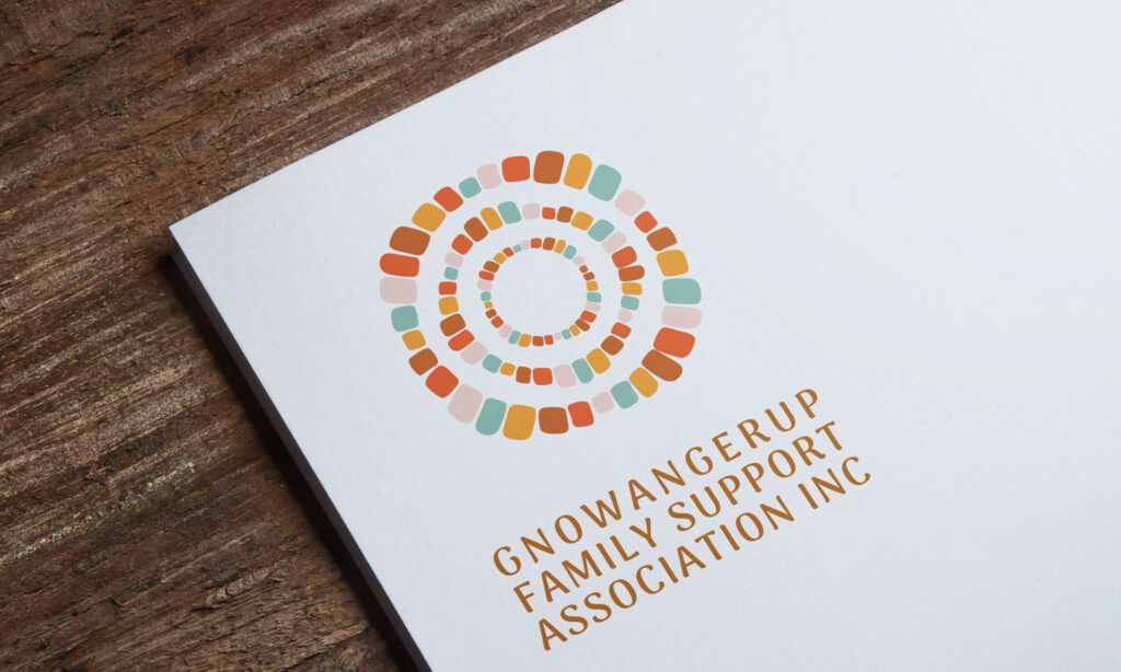
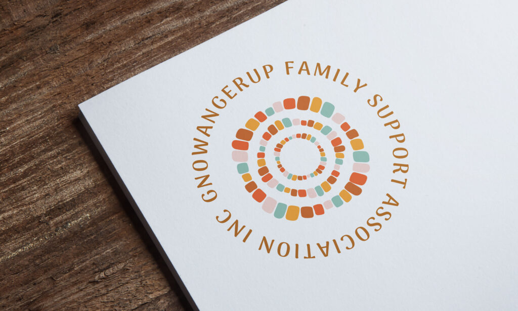
The Solution
Clever Octopus crafted a circular motif symbolising meeting places and community connection, with individual shapes representing people coming together as one. The earthy oranges, greens, and pinks capture both warmth and vibrancy, balanced by a versatile typography system that feels approachable yet professional. The logo suite was designed for flexibility, ensuring the Association could use it seamlessly across signage, stationery, online platforms, and community resources. A full style guide was created, providing clarity on colour palette, typography, and logo application to maintain consistency.
The Last Word
The rebrand gives Gnowangerup Family Support Association Inc. a strong, contemporary identity that communicates its values of connection, inclusivity, and support. The new brand is not only visually engaging but also meaningful, providing a foundation that strengthens trust with the community and reflects the Association’s vital role in supporting families.