A Brand Built on Safety, Dignity and Hope
The Challenge
Kareba House, the Central Great Southern Women’s Refuge based in Katanning, needed a brand identity that could hold deep meaning and sensitivity. Delivered in partnership by Palmerston Association and Kadadjiny Aboriginal Corporation, the service supports women and children experiencing family and domestic violence, mental health challenges, and alcohol and other drug concerns. The challenge was to create a brand that felt safe, warm, culturally respectful, and trauma-informed, while moving away from the cold or institutional feel often associated with crisis services.
The Idea
To create a visual identity that positioned Kareba House as more than accommodation, but as a place of rebuilding, healing, and empowerment. The brand needed to communicate shelter, care, resilience, and connection to community in a way that felt gentle, human-centred, and welcoming. The concept was built around the meaning behind the name Kareba, “to rise” or “to lift up”, reflecting the strength of the women and children the service exists to support.
The Solution
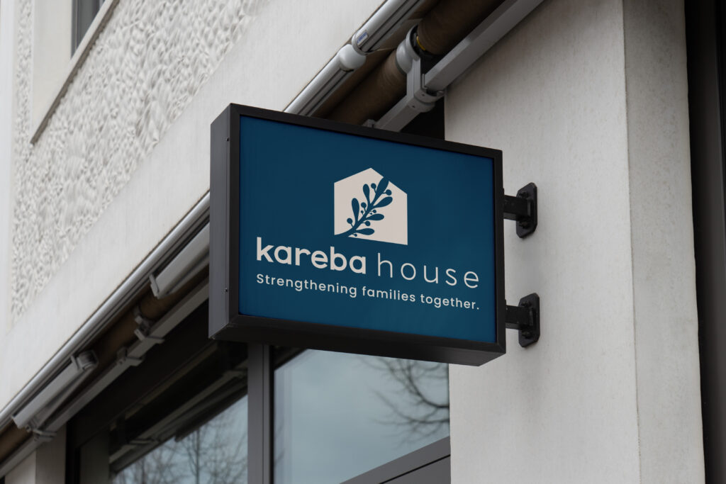
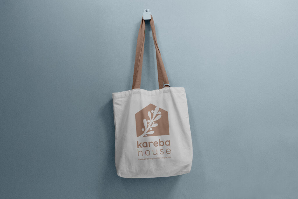
Clever Octopus worked with Kareba House to develop a thoughtful and cohesive brand foundation, beginning with a deep dive strategy session to uncover the heart of the service and how it needed to be experienced visually. From there, a full brand suite was created, including logo design, colour palette, typography, and a comprehensive style guide. The identity centred on a symbolic house and wattle branch mark, representing shelter, protection, resilience, and connection to land and community. Supporting collateral was then designed across key touchpoints, including business cards, letterhead, and a universal email signature, ensuring the brand could be rolled out with consistency, professionalism, and care. The overall visual language was intentionally soft and calming, helping Kareba House feel approachable, respectful, and hopeful across every interaction.
The Last Word
Kareba House now has a brand identity that reflects the depth and importance of its work, one that feels safe, grounded, and deeply human. With a complete visual system and practical brand tools in place, the service is equipped to communicate with clarity and consistency while reinforcing its role as a place of dignity, support, and new beginnings for women and children in the Great Southern.